
Jennie C. Jones
Out of the corner of my eye, I thought I was looking at just another instance of still more minimalism, an artistic predisposition toward which I’ve always felt some ambivalence – whether the fundamentalist pin striped suits of early Stella or The Platonic Republic of Judd. After decades of seeing this stuff seemingly everywhere, I’ve since learned ways to see minimalizing work; but images of purity (and its implied or actual [pearly] gated communities) continue to aggravate my suspiciousness. None of this is at all meant as argument against quiet, subtlety, spaciousness, clarity or simplicity.
Jennie C. Jones’ application of spare elements seems to be differently motivated toward other varieties of experience and awareness than visual austerity per se. It caught me peripherally on the way elsewhere and I stopped. The last thing on my mind was any direct associations with sound. When I saw the title of her show at Sikkema Jenkins & Co., I assumed the word Tone referred to color and value, maybe attitude, but certainly not pitch or timbre. Nevertheless, the artist’s reference toward sound was intentionally explicit, as I read later.
Curiously, as I try to articulate what I saw, it’s very easy to conceive of Jones “hearing” shape, color and texture, not in a literal correspondence, but in synesthetic tone parallel. The thinking through of the closeness of color feels less “minimalist” than like subtle sortings among pitches, pulses or orchestrations. And, what especially made me take a second look at these pieces was their asymmetrical pacing, which made them feel alive (very much in contrast with the industrially ruthless “perfect” mathematics of many of the canonic minimalists) and much more complex. The softness of surface and color, their almost self effacing patience, evokes the expectant receptivity of listening.
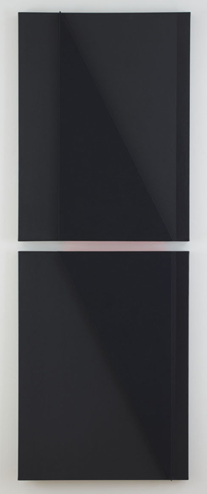
Many, if not all, all of these pieces are constructed with two layers of panels, which, when viewed sideways from a tightly acute angle, narrow into strikingly fine zipstriped constructions in themselves. The frontal surfaces display black, gray or whitish assemblages of acoustic panel and painted surface, overlapping vertically or diagonally, accented with occasional single narrow stripes of hot industrial orange, usually at a vertical edge.
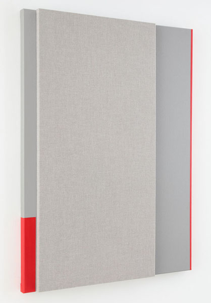 This orange especially surprises when painted along the outer edge of a rear panel, which emits a colored aura out onto the white gallery walls like a resonance, a memory, echo or overtone. These are very beautiful and inventive visual constructions emerging from a very distinct identity.
Going back to view the works online, my own synesthetic inclinations were just a little disappointed by learning of titles such as Deep Tone with Bold Double Bar Line and Vertical into Decrescendo in that they invited literal associations with musical notation, which implied that these constructions were somehow intended as illustrations of such (although I also loved more ambiguous, perception bending titles such as Quiet Gray with Black Subtone). I would personally rather have been surprised by my own phenomenal and associative experiences (which I was) than be told what I’m supposed to see (although artists really do have a point in limiting the potential misinterpretations of what they’re doing in this way).
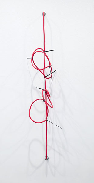
There are also the drawing-in-space SHHH, The Red Series, constructed with orange noise canceling instrument cable, a short, alluring recorded sound work built from feedback (I can only imagine the spatial dimensionality if better speakers were available) and a series of graphic notation collages, complete with musical staves, A Score in 8 Measures (for Melba Liston), dedicated to the important trombonist and orchestrator.
Musical notation may offer a useful conduit for compositional information, but it doesn’t actually look the way music sounds. (I also think of Cecil Taylor’s comments on Stockhausen in A.B. Spellman’s Four Lives in the Bebop Business – “They showed me the scores and the scores said this: We are very pretty. Look how pretty we are.’ … In jazz the cats don’t waste their visual energy. They don’t divide themselves, and they should divide themselves even less.”)
In contrast, what’s so persuasive and affecting about these painted and assembled works of Jennie C. Jones is that they accomplish a sympathy for aural sensibility (and much more) without even having to say so.
Vertical into Decrescendo (dark), 2014
Acoustic absorber panel and acrylic paint on canvas
2 parts
98.25 x 36 inches overall
249.6 x 91.4 cm
Photo: courtesy Sikkema Jenkins & Co.
Quiet Gray with ¾ Red Reverberation, 2014
Acoustic absorber panel and acrylic paint on canvas
48 x 36 inches
121.9 x 91.4 cm
Photo: courtesy Sikkema Jenkins & Co.
SHHH, The Red Series #4, 2014
Noise cancelling instrument cable, cable ties and endpin jacks
37.75 x 8 x 10 inches
95.9 x 20.3 x 25.4 cm
Photo: courtesy Sikkema Jenkins & Co.