
Ron Morosan
July 2021
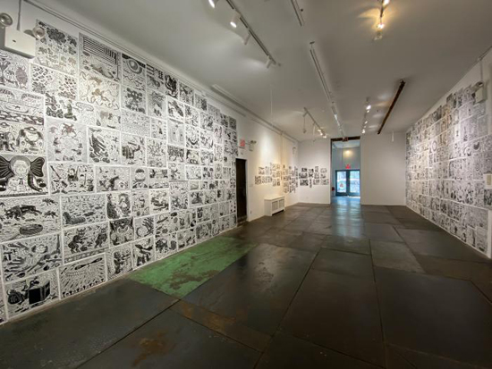 Richard Mock, The Cutting Edge, Kentler International Drawing Space, Red Hook, Brooklyn
Anyone who was a friend of Richard Mock or knew his political linocuts from the Times Op-Ed pages, endured four years of Donald Trump’s presidency missing Mock’s linocuts and trying to imagine what fabulous images Richard would have produced to reveal the antics of one of the most outrageous presidents we have ever had.
Richard’s death in 2006 left us without our Cutting Edge Soldier of political insight and psychological acumen into the pathology of power in the USA.
Now the Kentler has a large retrospective, or a sort of one. In total there are about three hundred prints on display. They are installed in two separate spaces. In the small front gallery there are seven framed prints on view, with another ten shown in a large flat file. However, the major part of the exhibition is in the large back space where an installation style arrangement of prints occupy two walls floor to ceiling, with one area to the right reserved for a portfolio of Op-Ed linocuts from the show of Mock’s work at the Times that started at the Sheldon Memorial Art Museum in Lincoln, Nebraska and toured the entire year of 1987. Entitled Mock of The Times, this sixty-print exhibition was accompanied by a catalogue produced by Mock Studios, with essays by Timothy Cohers and Barry Schwabsky. In this exhibition Richard introduces some of his classic characters like big toothed crocodiles, big birds, huge wolves and other raucous beings, all cut with an expressive and percussive style that bangs out the message.
One of my favorites from the Times Op-Ed exhibition is the bulgy eyed wolf with a car in its mouth accompanying the letter to the editor by Robert Gibbons titled, “The Safety Trade-Off of Fuel Efficient Cars” of 2/28/81. Here Mock takes a humorous twist to the consumer concept, in which cars are consumer food, just as a big juicy leg of a lamb is food for a wolf.
Another from the exhibition is coupled with “Mexico Needs Special Help” by Robert D. Hormats dated 2/26/86; it shows an American eagle with a snake in its beak standing atop a cone in a round pool of water or blood with hands projecting out of the liquid. Around the pool are large dollar coins. The message is critical of imperial power that is displayed by the eagle with outstretched wings in the manner of a Nazi eagle emblem. There is no doubt that the special help Mexico will receive will aid the USA in helping itself to power over Mexicans.
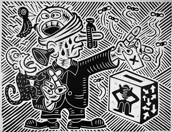 American Voter, linoleum block print, 15″ x 19 3/4″, 2002
I think it is important to remember that Mock above all was a critic in graphic form. He was an activist and an anarchist who needed to get the message out that people must be free to live lives without corporate or governmental coercion. In this way his Op-Ed prints were not just illustrations. They conveyed a message of their own that went in a number of directions at once, some which carried the content of the article and others that were pure Mock.
So, how did Mock develop such a powerful graphic language? As a graphic style, Mock obviously carries on within the tradition of Max Beckmann and Jose Guadalupe Posada. But this foundation is then developed through a west coast ethos that coalesces around an early genius in the person of George Herriman, the creator of Krazy Kat. The scale of Mock’s characters, their spatial dynamic and loose expressive style owe a debt to Herriman. It could be said that the whole west coast tradition of graphic humor that developed in the sixties with Zap Comics is influenced by Herriman.
Zap Comics impacted the global art scene because it took what was known as the funnies closer to the area of art. Cartoons by Crumb, Griffin, and S. Clay Wilson certainly were known to Mock. He personally knew Wilson and visited him on at least one occasion.
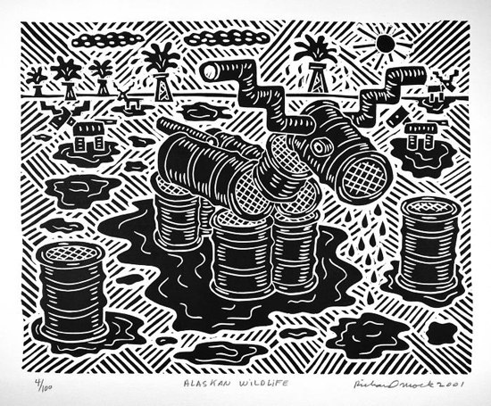 Alaskan Wildlife, Linoleum block print, 14″ X 18 1/8″, 2001
Yet, we need to remember that Mock took this drawn graphic language into the medium of the linocut. This is no small achievement. Anyone who has made a linocut knows that the expressive quality in this medium is not easily attained. For example, how does one create space in the graphic language of linocut? Mock developed his own very orderly technique of interwoven parallel lines that grid space into a pattern. This has been used by other artists, Herriman included, but Mock treats it with much more precision and systematic aplomb. The hilarious print titled “Alaskan Wildlife,” 2001, shows this technique well. In the center of the composition a ridiculous elk or reindeer is made out of oil drums and drips oil in a landscape of distant spouting wells. It is funny, but very sad. Still, it is the truth about Alaskan oil development.
As a graphic critic Mock possessed an acute psychological skill to analyze various politicians with extraordinary accuracy. His portrait of Bill Clinton is a devastatingly apt portrayal of the false Democratic president who was in fact more a Republican. Very few people realized this because Clinton was so good at playing “Mr. Wonderful” that the public never understood his true colors. In Mock’s print a contrite looking Clinton looks at the viewer directly, but he seems to be sitting in the lap of an elephant. Nothing more needs to be said: the message is clear.
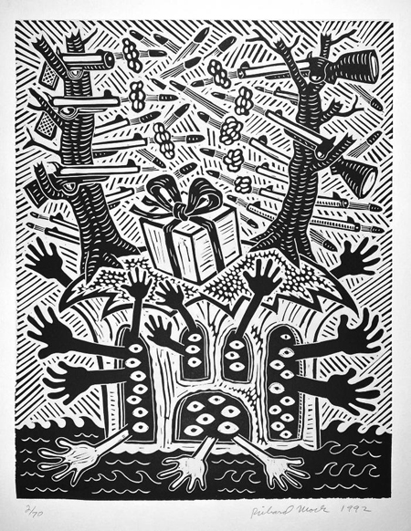 Untitled, linoleum block print, 1992
Some of Mock’s prints have no titles, but are filled with meanings. A large one from 1992 is enigmatic and disturbing. It shows a large tree stump out of which two trees on the right and left grow, but they have their limbs chopped off, and at each stump of branch a rifle is shooting bullets from left to right. Within the stump are many eyes looking out from window-like openings with black and white hands reaching out for help. The whole scene floats on a black ocean. Placed front and center in the middle of the large stump is a white gift box wrapped with a ribbon. What does it mean? Is it an ecological statement? Is it man destroying nature with war and being trapped within his own aggression?
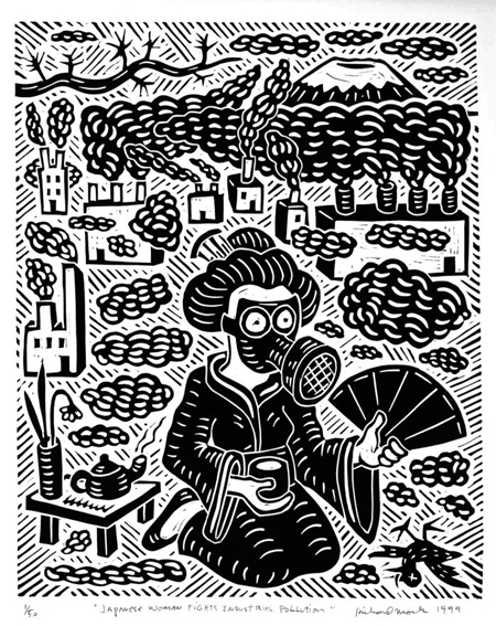 Japanese Woman Fights Industrial Pollution, linoleum block print
20″ X 18″, 1999
When Mock comes closest to an outright cartoon, he is overtly ironic.This is the case with the print “Japanese Woman Fights Industrial Pollution,” 1999. In the foreground a woman in a kimono wears a gas mask and fans the air with one hand and holds a cup of tea in the other. In the background factories spew out billowing smoke and pollution.
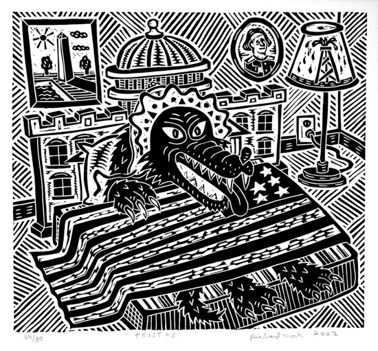 Trust Me, linocut, 18″ x 20″, 2002
For Mock the linocuts served as a form of public address, a way to get messages to the people. In many prints this takes the form of conveying alarm, danger, or threats to civil rights, the environment, freedom, or simply the right to live without coercion from corporate power and authoritarian government. A character Mock used frequently to embody this corporate power is the wolf. In the print titled “Trust Me,” 2002, a huge wolf is lying in bed with an American flag for a blanket, the bonnet of a grandma, and its mouth open showing fangs and tongue. The Washington capital building is the headboard. As in most of Mock’s prints the message is transparent: the wolf as the power structure is waiting for all of us Little Red Riding Hoods.
Linocut prints were one part of Richard Mock’s life’s work, his oeuvre. He was above all a painter. He had numerous exhibitions of his paintings in which some of the same characters appear, but in the paintings they are performing on a larger stage. He dealt with big issues in his art: comedy, tragedy, the mystery of life, science, evolution, culture, good, evil, a whole panoply of concepts that many art critics or historians would put into the tradition of Expressive Surrealism, or Expressive Social Commentary. I would call it Expressive Metaphysics.
For many American artists the business of the art world could rub the wrong way to an independent spirit. The commercialization, the social hobnobbing, the behind the scenes clubs and power brokers could become bureaucratic and oppressive. Mock had a kernel of resistance in his being that caused him to go his own way. Resistance is an important element in critical thinking; it is what makes us ask questions, look deeper into what goes on in the world, and above all look for the truth. Mock had a sharp intellect to accompany his talent as an artist and together they formed a model of what it means to be authentic in art.
 Balancing Act, linoleum block print, 19″ x 16″
Richard Mock: The Cutting Edge →
June 12-July 25, 2021
Kentler International Drawing Space
353 Van Brunt Street
Red Hook, Brooklyn, NY
All images courtesy of Kentler Gallery
◊
Ron Morosan is an artist, writer, and curator. He has shown his work internationally at the American Pavilion of The Venice Biennale and the Circulo De Bellas Artes in Madrid, Spain. In the US he has shown at the New Museum and had a one-person exhibition at the New Jersey State Museum, and at numerous galleries in New York. He curated the Robert Dowd exhibition, Subversive Pop, at Center Galleries in Detroit, as well as Denotation, Connotation, Implication at Eisner Gallery, City University of New York. He has written catalogues for many artists, including Enid Sanford, Tom Parish, Robert Dowd, and others. In the 1990’s he started and ran B4A Gallery in Soho, New York, writing press releases, articles, and catalogues.