Material Poet
patrick brennan
February 2014
I still remember seeing years back a sculpture by Nicholas Mukomberonwa that, except for a single chiseled dent about 3/4 of the way up a vertical edge, presented nothing but otherwise untouched polished stone. I felt whisked by its peculiarly visceral numinosity and presence. Even an airtight cognitive or perceptual explanation wouldn’t actually displace these direct sensations of mystery and resonance. Something’s there, even if that “there” might only turn out to be us.
Whenever I happen upon an exhibit of Richard Tuttle, I quick jump through irritation at the tchotchke cluttered flotsam he seems to throw together only seconds before I’ve found myself already engrossed. What just went down?
Some provisional works for a major exhibit at the Tate Modern’s Turbine Hall in London later this year are on display at Pace on 57th street. As soon as I stop dwelling on the whats of the materials, which are, for the most part, quotidian thises and thats, I begin to see.
It must not be about the stuff – even though it’s evidently not there to be ignored either. I don’t see the things they’re made out of so much as message, symbol, hint, reference, display, clue or meaning. They don’t stand FOR, they stand – or lean or suspend or attach. They’re not especially “nice” to look at either – ugly, or especially cultivated, camp, austere, platonic, ironic, iconic or utilitarian – which makes for an intriguing outness all by itself.
What I do notice are their relations, and especially their differences and how he rhymes them.
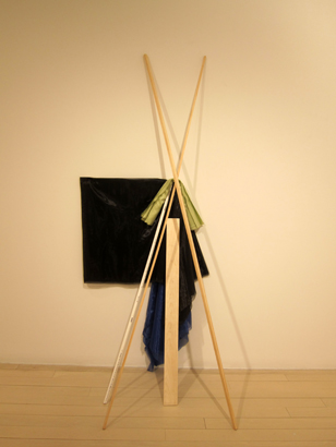
Looking for the Map 9 crosses two differently widthed 8’ lengths of stock lumberyard trim wood into a 3:5 proportioned X that leans back nonchalantly against the supporting wall. The slight dissimilarity of their lateral shapes (one’s rectangular, the other square) isn’t at first very noticeable because they register so closely identical; but suddenly, like a rug just slipped out from under you, it emerges as accent. A further rhyme cooly leans just a bit off to the back, parallel to the X’s lower left branch, an unadorned 3/8” PVC pipe, not wood; ROUND, not cornered. The shinier whiteness of this tube, more distant spatially, advances toward the flat eye ahead of the wood’s beige matte.
And as if that wasn’t enough, a narrow, 3” wide plank stands at 90º between the legs of the X, a moment off center so as to graze nearly the leg to the left with its corner not too far beneath the diagonal’s crossroads. Behind, a bluish black piece of fabric, suspended in front of the wall hears this and expands the plank’s edged-flat top into a full horizon that stretches leftward from the X-wood’s intersection to unfurl a nearly squared flag. But, going the other way, the cloth doubles instead the right diagonal. Below and between, this material releases all rectalinearity to the wind shaped pull of gravity as it backdrops the vertical plank nearly all the way to the floor. This X wears a tie where it crosses itself, an off-chartreuse stretch of fabric that crowns the the wood’s lower triangle to meet the latitude attained by the off centered plank. The upper portion reaches unadorned. Then, there are the shadows.
There’s a surface temptation to project hearsays of Zen, suspicions of solitude, modesty & simplicity at a construction such as this, but it’s actually a roaringly convivial ensemble of hocketing relays that toss moves back & forth like an ace soccer team. Rather than minimalist (this isn’t really reductive), there’s plenty of enlivened spaciousness that allows all this echoing racket to get noticed. It reminds me a little bit of the spacing and pacing of instrumental parts in Henry Threadgill’s Zooid. The circuits re-enliven themselves indefinitely.
The rhymes are pivoting commonalities. The drawing distributes itself among the contrasting materials. One takes up a line drawn by the edge of another, or echoes another quality.
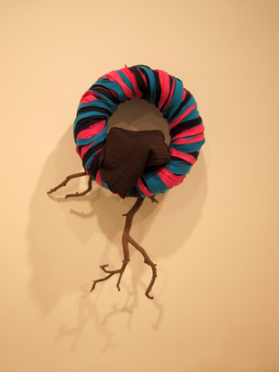
Just to the right of the X work hangs Looking for the Map 10, a donut shape rung with loosely consecutive ribbons of dark hot pink, turquoise and black. The felt-like pillowy softness of the wrapping is interrupted by the harsh surfaced angularity of a tree branch that juts out from beneath like a torso and running legs under an enormous caricatured head. But this doesn’t at all illustrate a human figure, only an enigmatic puzzling among differences. Tuttle lays a single mediator across the base of the hoop a piece of fabric, texturally kin with the ring’s drapery, but coloristically linking to tree bark brown.
It’s possible to find just as much surprise and refreshment in each of the other works in this exhibition. What I see in so many of them is a delight in paradox and contradiction grounded in a profound sympathy for gravity that’s worked out through brusque pronouncements that declare sensations of horizontality or verticality, through play with what leans – and in plenty of room for what hangs and for what falls. Curiously, it doesn’t tire out.
Richard Tuttle, Looking for the Map, Pace, photos: Arteidolia


