
Donald Martineaw-Vega
January 2015
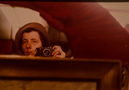
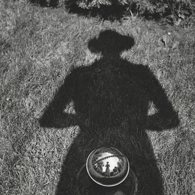 Self-Portrait, undated
Vivian Maier: In Her Own Hands
Howard Greenberg Gallery October 30 – December 31
When I was in photography school, we had an assignment to go out and photograph life, what you saw in front of you, and to engage with each person. I went to the beach and there was this drunken man who had just finished off a bottle. After I took his picture, he started to cry. I suppose I made him see what he looked like just by pointing the camera at him. I decided right then that I didn’t want to do this kind of photography. I felt bad that I had invaded his space, his life.
Voyeurism. We are all voyeurs and are afraid to be caught doing it. Once you get over that, it becomes easier and easier. You look for more challenges and the satisfaction of getting the “image.” Once you get the image, that’s it. It’s done. You don’t have to show it. You have already experienced it. You put it away.
I think Vivian Maier did not want to be exposed for what she was. A voyeur. Trying maybe to reconcile her voyeurism through self portraits. She was exposing herself for what she was or trying to reach herself. I don’t know. Printing it or showing it to the world was not what she wanted to do. I think taking the picture was her artistic satisfaction.
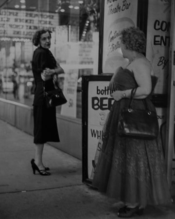
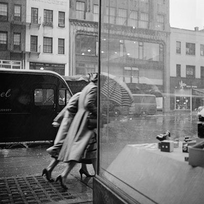 New York, NY, October 29, 1953
Looking through a book of Vivian Maier’s photos. A mirror in a parking lot. Her reflection. The camera hangs low on her chest. She holds it so it doesn’t swing. The shutter button is very quiet. Her subjects could never hear it. That’s how she was able to do all those candids. But no interaction. She doesn’t seem to interact with her subjects at all. As a photographer you want to get some sort of response. You want some connection. Otherwise, it’s a very static picture. She is just recording life passing by. Slices of life. Lots of self portraits. She doesn’t have much expression on her own face. There’s a confrontation. Not too happy. New York 1954. Another confrontation. Subject not happy. Looks like Bryant Park. Mirror. Penn Station. Lots of shadows. A Weegee. She never missed an opportunity to photograph herself. Color 1962. Window mannequin wearing a hat. Here she’s got both a 35mm and a 2 1/4 around her neck. This picture of a clown in his car would have been a better picture if you could see the street scene, the chaos going on around him or if we knew what he was smiling at. Here she is again in a VW hubcap. Very nice still life within this picture. Lots of fruit in a shoe box. She’s developing her own film in the bathroom and hanging it up in the shower. She often made photographs that referred to image making. Movies. Film in boxes. The green is Tri-X. The red is Panotomic-X. All black & white.
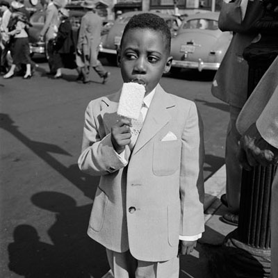 New York, NY, April 10, 1955
You can see the texture of the coconut and the texture of his suit’s fabric. This is a beautiful print. It has all the tones, whites, blacks, mid-tones. There is detail in the deepest shadow. I think it’s one of her best pictures.
New York, NY, September 3, 1954. She is wearing a pearl necklace and dangling spherical earrings. It looks like you can see a reflection of Maier in the earring. She cropped with her camera. Whoever printed these just printed exactly what was on the negative. These photographs are full frame, 2 1/4 taken with a Rolleiflex. Viewfinder on top, lens in front. Looking at the photo of three young men sitting on a metal container which says “HELP KEEP OUR CITY CLEAN.” The image is very soft. Sort of running downhill. Sloping. Not crisp.
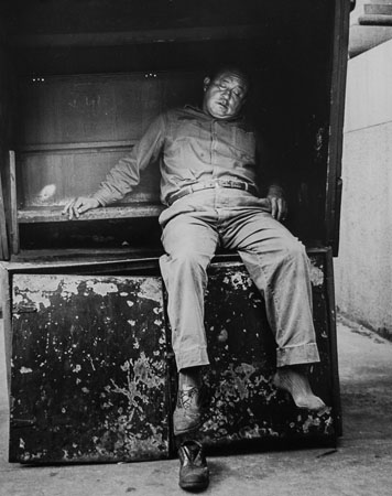
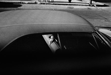 Chicago, Il. 1969
Before bucket seats. It’s hard to tell if there is another person in the car. All you see is the arm. It’s a beautiful print, except that in the printing it could have been made even better. Look at the top of the photo, the curb across the street. I think it should have been cropped out or “burnt in.” “Burning in” would have gotten rid of most of the detail here so there wouldn’t be so much distraction in this area. It looks like she used a very fine grained film.
Here’s another print that’s a little muddy, not quite enough tones. You need detail in the blacks and whites. That goes back to Ansel Adams and all the masters. That is something you do in both the taking of the photo and in the printing of it. You must expose the negative so you can have detail in the highlights and in the shadows.
Photo of inside a nightclub. Woman in a white leather jacket. Man with a cigar reading something pinned to a wall. I don’t know how they chose any of these photos to be in this show.
Untitled, 1956. Color shot. Back of a woman in print dress. Tension in her hands. This is the picture on the exhibition’s card. Not a lot of composition in this one. Probably processed and printed by machine.
Museum one and two. This could almost be shot for the Saturday Evening Post. All three of them are well dressed, maybe a Sunday afternoon. Cutting out the top of the composition, including skylights. If you look, the image is below. Top area again is a distraction.
Moving to a wall at the end on the left. The curator told me these are the photos that Maier actually printed. They are very flat compared to the rest of the show. Composition-wise they are very beautiful. Dust on the negatives. Not printed very well. I don’t think she had the technique for developing and printing to give them more contrast. A wall of color snapshots. Self-portraits. New York. Mannequins. Garbage can. White traffic lines on street. Crumbled up newspapers. These look like old prints. The color has faded.
Self-Portrait, Chicago area, c. 1960-76. I like this one of her with a very early Leica. It was a very mechanical camera. Hit or miss. At that time they had a very archaic hand held light meter. You would have to know your exposure. This may be the camera she got from her mother.
 Untitled, c. 1953-63
Back to the B&Ws. Good subject. One shoe on. One shoe off. Deconstructing this as a photograph. The subject is bottom lit with what they used to call “horror lighting.” The sun is hitting the concrete in such a way that it is reflecting upward.
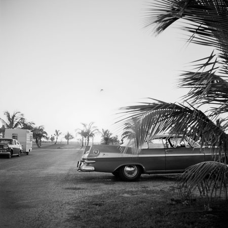 Florida, date unknown
What I find interesting about this one is the symbol of the bird on the car and another bird in the sky. Very nice print. Vignette, corners dark. When you are in the dark room and the image is on your paper, everything is the opposite. Darks are light, lights are dark. When setting up to make a print you do a test strip. Using a diagonal strip of photo paper, you would make sure to include the sky, the car, the ground so you get all three to test for an exposure. The enlarger has a lens just like a camera. You set the F stop on the enlarger. Usually you want a long exposure so you make it 5.6 or 8. That makes an exposure of about 45 seconds or a minute on the paper. Make that exposure without manipulation. Develop the test strip. If you see detail in the darks and lights, do a full sheet of paper and while exposing, dodge and burn areas where you want more or less exposure. Here you can adjust the bottom and also burn in the top. Falcon and bird. Sun is coming right into the lens. It’s an effect. It’s a textured light.
 Chicago, Il. 1954
Has all the tones. Pure whites. You have black with detail. It’s a perfect image. It’s very well done and printed well. It is the best print in this show.
Self-Portrait, New York 1954. You can judge how well it was printed by the detail in the paper towels. Toaster. There she is. Layers of paint. Maybe she was influenced by Italian film. You don’t know who is looking at her? Someone in a car? A little dynamic action. A bit of mystery. Sargent’s Pharmacy. Very nice picture. She loves the reflection. Detail in the black.
 Chicago, Il, date unknown
Camera shake. She probably saw the couple and it made her nervous and excited for the picture at the same time. You can tell it’s camera shake and not out of focus by the trail of the image. These are all images made from Maier’s uncropped negatives.
 Untitled, c. 1955-65
Picture of a hefty woman with a handbag and a red lace dress. Although the pic is B&W I say a “red” dress. Film then could not record red properly. Newer films record red almost as a black. This is flat gray. These letters should be black. Look at it and squint. What’s a better picture? When you squint it makes it darker. And the whites get whiter. It’s much better that way.
Double self portrait. She did a lot of these where you can see 3 or 4 of her reflections. Same thing, you squint, it’s a better print. This is washed out. Not overexposed, but printed badly.
Paper comes in many grades 1, 2, 3, and 4. and each manufacturer had different qualities; Agfa, Illford, Kodak. When you do a print you have to pick the right paper. If the printer had used a graded paper (single weight) like a #3 paper (which adds contrast), and if there wasn’t enough contrast, a filter between the projector and the paper could’ve been used to add more contrast. Also, there are choices in the developer. Harsh, soft. That you have to know. While the print is developing, if you want the highlights to get darker, you would rub that area with your hands in the developer. The warmth of your hands, and the movement of the developer causes that area to develop further and faster. Also if you air dry the print (as opposed to machine dry) it makes your blacks pearly black, and your whites whiter. If you machine dry, it flattens the tones. When you air dry, the emulsion is up. That’s what makes a master photographer. Being able to do all that. Take the picture, develop the film, expose the paper, develop the print, and mount the print. Knowing the difference between all the films, papers to print on, chemicals to develop with, that gives you the perfect master print.
Ansel Adams was a master photographer. When he took a picture with his 8 x 10 camera he exposed his film for the optimum tones in the scene. He developed his film with a “water bath” system where he developed the film for a period in the developer, then added water, swirled it around, dumped the water out and put developer in again. The developer acts on the highlights first. When you dump the developer and put in water the highlights stop developing but the shadows keep developing. Dump and add fresh developer, that starts working on the highlights again. So, what’s happening is it’s bringing the highlights and the shadows closer together. Otherwise you would have a print where the highlights are blocked up, meaning that when you put light through the negative, nothing comes through. When you use this system it allows some light to come through giving you details. Shadows are similar in that if you don’t have enough exposure you will have a black hole. If you develop the way Ansel Adams did those shadows start to come up. He invented this way of working, called it the Zone System. He used the same Zone System in developing the film. You need both.
Looking at Maier’s work I don’t think she took any of that into account. She was photographing the moment. I think she was afraid of her subject matter. She also hid all her film, not showing anyone her work. An outsider. She was probably self taught and was an amateur photographer who went way beyond that. She had a very good eye.
 Self-Portrait, Chicago area, c. 1960-76
Photo Images: Courtesy Howard Greenberg Gallery, New York, ©Vivian Maier/Maloof Collection