
Daniel Barbiero
February 2024
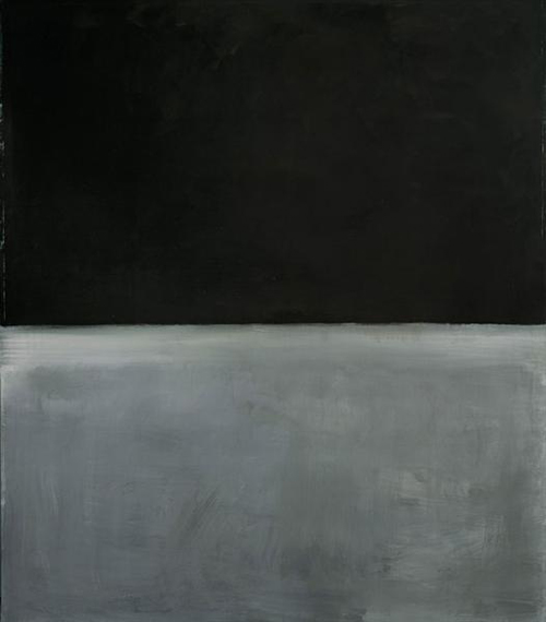 Untitled, 1969, image WikiArt
(You can click links throughout this essay to view paintings at the National Gallery of Art)
Not long before 1950 Mark Rothko began creating large canvases of sublimely luminous, blurry-edged blocks of color floating over background fields of related or contrasting colors. From that point on he parlayed that highly personal formal language into a signature that, with some variations, he would maintain until his death by suicide in 1970. But as The National Gallery’s exhibit of a selection of the artist’s paintings on paper shows, he arrived at this language after following a path that began with figurative work and led through myth-inspired semi-abstract paintings before culminating in his celebrated large abstract color fields.
Although Rothko (1903-1970) was best known for his large-scale canvases of the 1950s and 1960s, he also was a prolific creator of paintings on paper, many of which are finished works in their own right. During his career he produced over 1100 paintings of this type, from which curator Adam Greenhalgh chose approximately one hundred. As might be expected, given their renown and nearly universally acknowledged emotional power, the show is weighted toward work featuring Rothko’s signature color fields. Even so, Greenhalgh’s selection includes a broad range of work from 1932 through 1969, with an emphasis on pieces from the 1930s and the mid-to-late 1940s, as well as on paintings in Rothko’s fully mature style of the late 1950s and 1960s. Given these curatorial choices as well as the exhibition’s chronological arrangement, Mark Rothko: Paintings on Paper provides us with an effective survey of Rothko’s development as an artist.
The 1930s
To virtually all appearances, Rothko’s paintings of the 1930s give little hint of the emotionally powerful, formally distinctive art that would follow. These early pieces are landscape and figurative works whose subjects are often presented in an awkward or distorted manner. Nevertheless, there are some hints that point to Rothko’s future development. Where we do see the later work prefigured is in Rothko’s use of color as a basic structural element and in his tendency to eschew volume in favor of flatness. In his watercolor landscapes of Oregon, done around 1933, Rothko reduces the details of tree trunks, leaves, ground, and underbrush to dabs and swathes of watery blue-greens, browns, and greys. The colors are allowed to bleed into each other in a way that seems to predict the interaction of the soft-edged floating rectangles of the 1950s and 1960s. In 1934’s The Bathers, one of a series of watercolors of bathers on the beach, Rothko depicts four thick, monumental figures on a thinly-hued brown ground. The figures are monstrously proportioned and lack individuating detail; unusually for this period, Rothko hints at their volume by portraying them with alternating washes of dark and light color. Another watercolor from the bathers series shows two flattened, elongated, and standing figures whose pale white limbs contrast with the dirt-brown sand dune that backdrops them. Above the edge of the dune the sky is a grey-black wash of color. Rothko’s reduction of the figures and beachscapes in this and similar pictures to flat, featureless spans of color gives them an almost abstract appearance.
In these as in other paintings from the same period, Rothko’s preference for color over volume and illustrative detail reflects the influence of Milton Avery, with whom he associated in the 1930s. It also reflects the influence of Matisse, whose works he admired. Matisse’s influence is detectable not only in a seated nude that recalls one of the latter’s odalisques, but in an untitled watercolor of 1938-1939, which shows a seated figure in an interior. Unlike Matisse’s bright colors the colors in this painting are generally turgid – pinks, blues, grey-whites, pale greens, and browns. Rothko arranges them in semi-abstract patterns of rectangles, grids, and curves that define the walls, the chair the figure sits in, the painting he or she appears to look at, and the windows framing the scene. If the patterned fields and some of the dramatic color juxtapositions recall Matisse’s interiors, the muddy grey head in distorted profile is typical of Rothko at the time.
The 1940s: Myth and Surrealism
The show’s most striking work covers the decade of the 1940s, a period when Rothko’s art underwent a qualitative leap. If the paintings of the 1930s show an artist searching for an effective means of expressing a sensibility that already is beginning to make itself felt, in the work of the 1940s we can see him finding his voice both in terms of content and the plastic vocabulary with which to express it. At the beginning of the decade the figure still predominated, but by the middle years he was showing evidence of a line of development that would take him to pure abstraction. What facilitated that leap were the interrelated influences of myth and Surrealism.
Due in part to a vogue for depth psychology of both the Freudian and Jungian varieties, the idea of myth was ubiquitous in the New York artworld of the 1940s. Myth wasn’t necessarily thought of in terms of specific stories and figures, although there was that – a number of paintings of the period evoked the Oedipus cycle, for example. But in general, myth was valued as a source of the symbolic representation of perennial patterns of human action and ways of being-in-the-world – as a primordial and presumably unconscious locus of images and structures of thought prior to and underlying more conscious or deliberate attempts to articulate existential meaning. Together with his longtime friend Adolph Gottlieb, Rothko turned to mythological themes sometime around 1941; consequently, he began to produce paintings with titles alluding to events and characters drawn from Aeschylus’ tragedies and the Abrahamic religions.
Despite his references to particular myths or rites, Rothko did not intend his paintings simply to be illustrations of literary sources or religious cult practices. He wanted them to convey content that, in transcending the specific forms individual myths or rituals might take, would express more general human truths regardless of how accidents of culture might imprint or embody them. Rothko’s universalist or generic orientation is reflected in some of the titles of the mid-’40s works included in the show: Ancestral Imprint; Prehistoric Memory; Incantation; Sacrifice. As these titles imply, and as he explained in a broadcast on WNYC radio on 13 October 1943, myth, for him, had to do with “the eternal symbols upon which we must fall back to express basic psychological ideas.” One of these basic psychological ideas consists in the state of foreboding that accompanies an encounter with something we take to be an ominous sign. Rothko’s Omen of 1946 expresses this in a subtle way through color and composition. The painting is a monochromatic light beige-grey with a pale cruciform dividing it into roughly equal quadrants. The top half contains a vaguely feline-like figure facing left, while the bottom right-hand quadrant contains a figure suggesting a human form with exaggerated legs. Just off-center is a bright red, near-semicircle throwing off threadlike lines. This shape, given the color of warning, seems to represent the omen itself. The contrast between the pale, neutral background and the brightly colored omen placed at a slight remove from the center effectively conjures a sense of disquiet and disequilibrium.
Rothko’s engagement with mythic themes coincided with, and to a degree was facilitated by, his contact with Surrealism. During the 1940s, Surrealism was a powerful force among American artists hoping to find a new formal language that would take them beyond Cubism and American Scene painting. They were helped in this effort by the unfortunate circumstance of the war, which forced a number of major European Surrealists to seek refuge in North America, thus giving American artists first-hand exposure to them and to their work. Several of them settled in and around New York, which allowed Rothko and his contemporaries to meet them at social events, see their new work in the galleries, and in some cases forge working relationships with them. Rothko, for example, worked with the painter and printmaker Stanley William Hayter, a British-born wartime refugee who had been a part of the Surrealist group but had broken with them shortly before coming to America. Of the Surrealist work Rothko was exposed to through exhibits, the paintings of Joan Miro, which he saw in a 1941-1942 at the Museum of Modern Art, deeply impressed him.
Surrealism’s influence can be seen in the looser, improvisational appearance of Rothko’s work from the mid-1940s, which now included irregularly shaped fields of color, knots of serpentine lines, and quasi-organic biomorphic figures. Miro’s influence is clearly legible in the spider-like splotches and freely drawn filaments of 1945’s Baptismal Scene, a painting of watercolor, ink, and graphite on watercolor paper. We also can see something of Miro in the 1944 watercolor-and-ink Undersea Cabaret, with its floating, amoeba-like shapes, curvilinear forms, and squiggly lines suggesting undulating seaweed against a field of light sea-green flecked with white streaks suggesting foam. An untitled watercolor, ink, and graphite painting of 1944 is a beautifully composed symphony of blue, white, and black whose vertically oriented forms suggest shape-shifting alien piscine beings, while strong horizontal lines of blue and black near the bottom and midpoint anchor and balance the verticals. The picture’s classically apportioned layout contrasts strangely but effectively with the improvised-seeming appearance of the figures it contains. Vessels of Magic (1946), a watercolor and graphite work, shows a similar sense of perpendicular balance in its composition. The background field is made up of gradations of brown set out in horizontal bands; five vertical biomorphic shapes stretch across a pronounced horizontal band dividing the paper into upper and lower zones, creating the suggestion of a mirror-image effect. The division of the field into well-defined yet soft-edged rectangles of related color anticipates Rothko’s formal vocabulary of the next two decades.
Although his work during this period was moving away from recognizable figuration, Rothko denied that it was abstract. In the 1943 WNYC broadcast he declared that
Neither Mr. Gottlieb’s painting nor mine should be considered abstract paintings. It is not their intention either to create or to emphasize a formal color—space arrangement. They depart from natural representation only to intensify the expression of the subject implied in the title—not to dilute or efface it.
Rothko was not, in other words, simply playing with forms, but was instead using a formal language bordering on abstraction the better to express a certain kind of content, which he envisioned in terms of perennial, existential truths. He best summed up his fundamental attitude toward what his art was about when, in a letter responding to criticism by the New York Times’ Edwin Alden Jewell of a 1943 show of work by himself and Gottlieb, he asserted that “only that subject matter is valid which is timeless and tragic.” It was an attitude he never would abandon, and which would come to sharper expression in the second half of the decade and beyond.
The Later 1940s and After
It is around 1947 that Rothko’s fully mature work begins to emerge, as he moves away from the biomorphic figures of the previous years and toward the soft geometry and luminous colors of the next two decades. At the same time, he no longer titles his paintings, presumably to let them speak for themselves. One of the transitional pieces the show includes from this period is an untitled watercolor of 1948. The top half of the painting is divided into horizontal zones of oranges and yellows that seem to be prototypes of the later floating rectangles, while the bottom half contains blurry vestiges of the shapes that populated the paintings of the mid-’40s. More closely approximating Rothko’s fully mature style, an untitled watercolor from the following year is dominated by two rough squares, one dark red and one a very muddy blue-green outlined in blue, against a field of opaque orange. With a second untitled watercolor of 1949. made up of horizontal bands of bright oranges, yellows, green-yellows and dark green against a yellow field outlined in orange, we arrive at the classic Rothko color field painting. From this point forward, it’s largely a question of theme-and-variations.
The work displayed from the 1950s and 1960s shows the versatility, measured in nuance, of Rothko’s chosen pictorial rhetoric. While the paintings’ basic architecture is no longer a major variable, the choice of colors and their combination is. The emotional force of Rothko’s later work has everything to do with the colors he employed and the ways he juxtaposed them, as well as how much surface space he gave to each. The size of these paintings has grown as well, particularly in comparison to the work from the 1930s and even the bigger work of the 1940s; while they do not reach the proportions of his large-scale canvases, they are good-sized paintings in their own right, in which the viewer can become immersed. In the absence of titles to guide interpretation of the paintings’ meanings, and with no recognizable forms to allow one to impute narrative content to them, there is only suggestion and a color-bound evocation of mood, and that is where the immediacy of their impact comes from.
Two oil and watercolor paintings from 1959 show how variations in hue, area, and mass can express different moods. The first places a rectangle of red-orange over a white horizon line dividing it from a dark maroon rectangle about half its size; all of this is laid over a field of yellow. The brighter colors hint at a lightness of being at the same time that they are ballasted and balanced by the weight of the darker rectangle; the implicit motionlessness of the combination suggests a sense of equanimity. The second painting, by contrast, consists of two massive rectangles, one indigo blue and the other an indescribable orange-brown over a deep maroon field. The atmosphere here is somber and suggestive of the tragic sense that preoccupied Rothko, who claimed that he cursed God every day for having made humans mortal. As this and other paintings on the darker end of the color scale amply attest, Melopomene was his chosen muse.
The exhibition is notable for its inclusion of a large number of very late works from 1969, some of which show Rothko in the process of reducing his pictorial vocabulary. To be sure, there are examples of his classic style, such as an acrylic and ink on wove paper painting consisting of two dense red-orange rectangles divided by a dark orange horizon line on a bright orange field. But there are paintings that reduce the number of color fields to one or two – greys and blacks, in the most dramatic examples –, give them relatively hard-edged borders, and frame them within thin, unpainted white borders. In contrast to the heavy materiality of the grey-black paintings, several of these late paintings look as if they are in the process of vanishing. Their color fields seem to be made up of ghostly afterimages, as if they’d been laid down and then subjected to erasure. These examples take to a logical endpoint a trend noticeable in a number of the late paintings: a paring down of both the formal language and the material with which to express it, as if Rothko were attempting to divest himself of some of the conventions of a style that was threatening to become a formula. But there may have been another reason for this reduction of means as well.
At the time these late paintings were made, a younger generation of artists creating minimalist and conceptualist works had become the focus of the art world’s interest; large-scale gestural painting seemed a relic of an earlier generation fairly or unfairly characterized as self-aggrandizing. Rothko was very much aware of this shift in taste. The critic Irving Sandler reported that Rothko was concerned about what the younger artists thought of his work and whether it had “kept up with the times.” Given Rothko’s expressed anxiety about his relevance in a post-painterly art environment, the minimal pictorial rhetoric of the late paintings may be read as his response to the Minimalism that some felt had eclipsed his own. But if new art seemed to have turned away from the painterly rhetoric and existential concerns of the artists of Rothko’s generation, the basic predicament they, and Rothko, were trying to address – the predicament of human finitude and the contingency of existence – never went away, even if art chose to direct its attention to other things. Which is why Rothko remains relevant today.
Sixty years ago the critic Lawrence Alloway characterized Rothko’s art as belonging to what he termed the American Sublime, citing Edmund Burke’s description of the sublime as “tranquillity tinged with Terror.” As this exhibit demonstrates, both qualities pervade the best of Rothko’s work regardless of medium or scale.
Mark Rothko Paintings on Paper
National Gallery of Art
Washington, D.C.
November 19, 2023 – March 31, 2024
Daniel Barbiero is a double bassist, composer and writer in the Washington DC area. He writes on the art, music and literature of the classic avant-gardes of the 20th century and on contemporary work, and is the author of the essay collection As Within, So Without (Arteidolia Press, 2021).